Media outlets, brands and consumers have been using visualisations, in particular infographics, for some time now. One of my recent favourites is from MobileInsurance.co.uk who used this image to map London’s most theft-prone tube lines and areas to help make sure commuters don’t fall prey to pickpockets. As someone who doesn’t live in London but often has to catch the tube for business meetings, I now know when to be extra careful.
Another slightly more abstract but very beautiful visualisation that I love was created by Michael Markieta, a transportation planner at global engineering and design firm Arup. He’s spent the last year mapping flight paths crossing the globe, using information stored in Arup’s servers. You can check it out on the BBC’s Magazine.
Both of these are examples of visualisation done well. They take complex data and present it visually so that it’s much easier for readers to process, understand and learn from. This is the fundamental reason for using them. They make life easier. Our own experiment in the UK also provided scientific proof that people and teams work better with visuals. I’ve written about the results in more detail here.
Going Governmental
It now seems that the British government has wisened up to the benefits of visualizations as well. Understandably, the government is one of the country’s biggest holders of data because of the nature of what it does. Part of this responsibility involves releasing this data so the public can understand what changes are being made. Every year it publishes a guide to public spending in the form of a very wordy report. It is pages upon pages of excel sheets that, quite frankly, I find slightly terrifying.
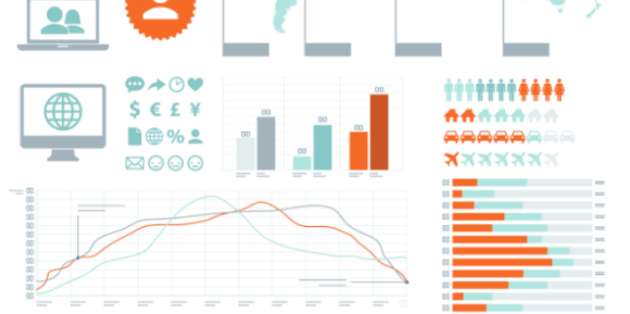
Thankfully, in 2010 Simon Rogers from The Guardian’s Data Blog had the clever idea to visualise the content of this report:
 As you can see, it’s much more digestible and actually rather pretty. You can read more about how he creates his impressive images on his very own blog. Since this, the government has started creating its own infographics alongside their many data heavy reports. You can view one of their most recent examples here, which visualises how the government has saved £10bn over the last financial year.
As someone whose working life is spent educating businesses on the power of visualisation, it’s heartening to see the British government using these techniques. For those of you looking to follow suit, Mindjet outlines another 5 ingredients needed to bake a great infographic in this blog post.